Your captions looked fine in the editor, then you dropped them onto a vertical clip and everything broke. The font was wrong, the text sat too low, and the platform's default styling made a clean short-form video feel generic. That's the moment when the SSA subtitle format starts making sense, because it gives you control over how captions appear on screen, not just when they appear.
SSA, short for Sub Station Alpha, is a text-based subtitle format created by CS Low (Kotus) in 1996 for the anime fansubbing community. It was built to do more than basic timed text, so it supports styling like fonts, colors, sizes, positioning, and karaoke effects, and its later evolution, Advanced SubStation Alpha (ASS, version 4.00+), pushed that control further for high-quality soft subtitles and typesetting-heavy work SubZap's SSA overview. That history matters because the format still behaves like a subtitle script you can shape by hand, which is exactly why creators who need crisp, reusable caption templates still reach for it.
What the SSA Subtitle Format Is and Why Creators Still Use It
A short-form creator usually notices SSA only after a tool-exported caption track looks flat in Premiere or gets flattened by a social platform. The text is there, but the spacing is awkward, the font feels off, and there's no clean way to move a line higher for a talking-head crop without rebuilding the whole caption set. SSA solves that problem by giving you a plain text subtitle script with real styling controls, so you can edit the file directly instead of fighting a limited caption panel.
The format came out of a fansubbing workflow, but the reason it survived is simple, it was editable in ordinary text editors while still carrying rich styling. That same combination is useful for faceless 60 to 90 second clips where you want captions that stay readable on mobile, survive compression, and match a brand look. The older SRT format is great for clean timed text, but it doesn't carry the same styling depth as SSA and ASS Fix Subtitles on SSA and ASS.
Why it still matters for short-form video
If your video only needs plain dialogue, SRT is usually enough. If you need positioned captions, speaker colors, source-matched fonts, or type that sits safely above a bottom UI bar, SSA or ASS is the better tool.
Practical rule: use SSA when the subtitle file itself needs to carry design decisions, not just transcript timing.
For short-form creators, that often means titles on the first frame, a top-centered hook line, or a repeated style template you can reuse across many clips. It's the subtitle equivalent of moving from a default font to a real brand system.
The Four Core Sections of an SSA File
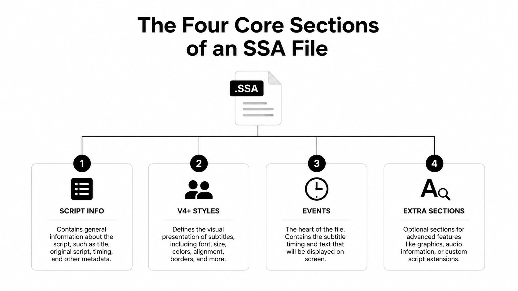
An SSA file is just a plain text document divided into named sections in square brackets. Once you know the structure, it becomes easy to scan in Notepad and immediately see where the metadata ends, where styles live, and where the timed lines begin. The multimedia wiki describes SSA around a structured script with a [Script Info] section, a styles section, and an [Events] section, which is the core layout you'll keep seeing in real files SubStation Alpha format reference.
What each section does
The [Script Info] block carries file-level metadata, such as script type and display-related defaults. The [V4+ Styles] block defines reusable caption looks, so you don't repeat font settings on every line. The [Events] block contains the actual subtitle lines with timestamps and style names. Some files also include extra sections for graphics or fonts, but those are optional.
A tiny skeleton looks like this:
[Script Info]
ScriptType: v4.00+

[V4+ Styles]
Format: Name, Fontname, Fontsize

[Events]
Format: Layer, Start, End, Style, Name, MarginL, MarginR, MarginV, Effect, Text
That order matters because the event lines usually point back to a style defined above them. If you open a file and only want to know where to change the caption look, start in [V4+ Styles]. If you want to change what appears on screen and when, start in [Events].
Reading Timestamps and Event Lines Correctly
SSA event lines look intimidating until you split one into its fields. The format begins with Dialogue, then a comma-separated set of values for Layer, Start, End, Style, Name, MarginL, MarginR, MarginV, Effect, Text. The timestamp syntax uses 0:00:00.00, with a period for milliseconds, which is one of the easiest places for beginners to slip if they're used to SRT's comma format.
A line might look like this:
Dialogue: 0,0:00:12.50,0:00:15.20,ShortForm,Creator,0,0,24, Hook text hereThe first number after Dialogue is the layer. The timestamps tell the player when to show and hide the line. The style name, here ShortForm, must match a style defined earlier in the file. The last field, Text, is the caption itself.
If you're used to thinking in SMPTE-style timing, a good cross-check is SMPTE time code for video producers, which uses a related mental model for reading time on frame-based media. SSA is still text-based, though, so the file wants clean punctuation, not a timeline export pasted straight from editing software.
Common mistakes that break timing
- Comma instead of period:
0:00:01,500won't behave like0:00:01.500. - Missing comma after layer: the parser expects every field in order.
- Minute and second confusion:
0:01:30.00is one minute, thirty seconds, not 1.3 seconds.
For a 60-second faceless clip, a line like 0:00:08.00 to 0:00:11.20 is easy to read, easy to trim, and easy to align with a spoken beat. Keep the timestamps clean first, then worry about styling.
Style Fields That Actually Matter for Short-Form Captions
The style block is where SSA stops being a transcript format and starts acting like a design tool. For short-form video, you don't need to obsess over every field. You do need to know the handful that change whether captions stay readable over a moving background, a face crop, or a bright product shot.
| SSA Style Field | What It Controls | Typical Value for Short-Form Captions |
|---|---|---|
| Fontname | Typeface used for the subtitle | A clean sans-serif that stays legible on mobile |
| Fontsize | Text size | Large enough for a vertical phone screen |
| PrimaryColour | Main text color | White or another high-contrast color |
| OutlineColour | Stroke color around text | Black or near-black |
| BackColour | Background or shadow color behavior | Dark tone for contrast when used |
| Bold | Weight of the text | On for hook lines, off for normal lines |
| Alignment | Anchor position on screen | Bottom center or top center, depending on layout |
| Outline | Stroke thickness | Enough to separate text from busy video |
| Shadow | Shadow depth | Light shadow for extra separation |
| MarginV | Vertical breathing room | Enough space away from edges and UI |
| MarginL / MarginR | Side padding | Keep text from touching frame edges |
The values that matter most
The Fontname decides whether the caption feels polished or default. The Fontsize has to survive a tiny phone screen, so short-form creators usually go bigger than they would for traditional video. PrimaryColour and OutlineColour do most of the visibility work, especially when the background changes from shot to shot.
Alignment deserves special attention. A value like 2 places text at bottom center, while 8 moves it to top center. That matters on TikTok or Reels because bottom-center captions can collide with interface elements, while top-center captions can keep the hook visible without blocking the subject. For many creators, Outline=3 with Shadow=2 is a practical readability combo for busy backgrounds, because the letter edges stay crisp even when the shot has texture or motion.
If you're choosing a typeface, the best font is the one that stays readable in a vertical crop. This short guide on subtitle fonts is a useful companion when you're narrowing down a style that won't fall apart on mobile.
Inline Override Tags for Bold, Italic, Color, Alpha, and Karaoke
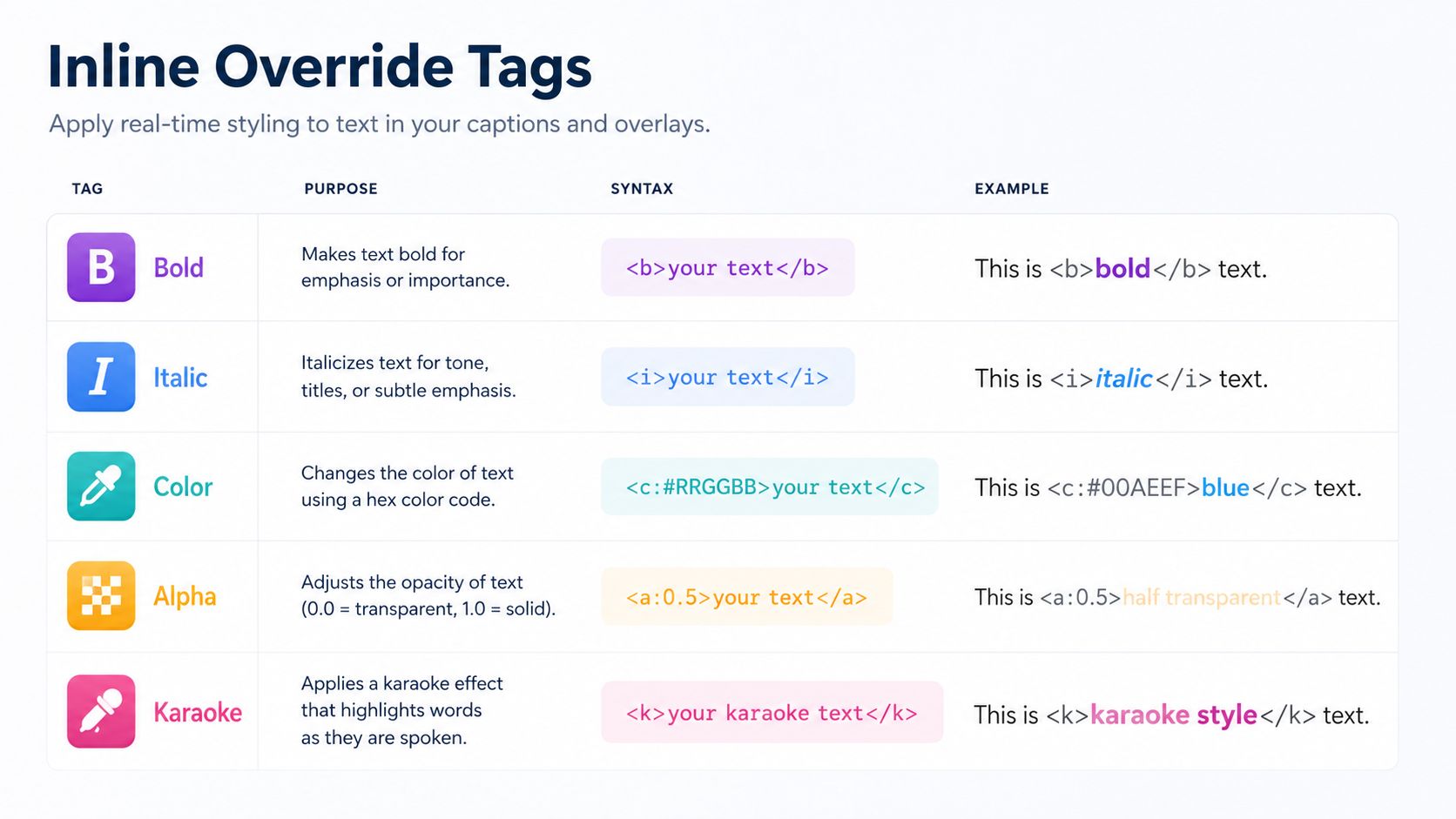
Base styles get you most of the way there, but SSA also lets you change formatting inside a single line. These inline overrides sit inside curly braces, so the player knows which part of the text should be affected. If you forget to reset a tag, it keeps applying until the end of that subtitle line.
The tags you'll actually use
- Bold and italic:
{\b1}turns text bold, and{\i1}makes it italic.Example,{\b1}Watch this{\b0}. - Outline and shadow:
{\bord3}increases outline thickness, and{\shad2}adds more shadow depth.Example,{\bord3\shad2}Clear on any background. - Color and transparency:
{\1c&H00FFFF&}changes the primary color, and{\alpha&H80&}makes the text partly transparent.Example,{\1c&H00FFFF&}Highlight{\alpha&H00&}. - Anchor and placement:
{\an8}anchors the line to top center, and{\pos(640,120)}puts it at a precise point.Example,{\an8\pos(640,120)}Headline here. - Motion and fading:
{\move(200,900,200,700)}animates text from one spot to another, and{\fad(150,150)}fades it in and out. - Karaoke timing:
{\k20}or its close variants split a line into syllable timing so words highlight in sequence.
If a tag changes only one word, wrap only that word. If it changes the whole line, keep it at the start so you don't fight your own formatting.
For short-form creators, the practical use is usually limited to emphasis, color accents, a quick top-of-frame hook, or one animated word in a punchy opener. TikTok and Instagram Reels often flatten styled captions into burned-in video anyway, so treat inline tags as an export-time design tool, not a guarantee that every platform will preserve the subtitle track.
A Complete Sample SSA File You Can Copy and Edit
A working SSA file for a vertical clip doesn't need to be huge. It needs clean metadata, one or two readable styles, and a few timed lines that match a 60-second edit. The sample below is small enough to understand and complete enough to render right away in a subtitle editor.

[Script Info]
ScriptType: v4.00+
PlayResX: 1080
PlayResY: 1920
WrapStyle: 2
ScaledBorderAndShadow: yes

[V4+ Styles]
Format: Name, Fontname, Fontsize, PrimaryColour, SecondaryColour, OutlineColour, BackColour, Bold, Italic, Underline, StrikeOut, ScaleX, ScaleY, Spacing, Angle, BorderStyle, Outline, Shadow, Alignment, MarginL, MarginR, MarginV, Encoding
Style: ShortForm, Arial, 54, &H00FFFFFF, &H000000FF, &H00000000, &H80000000, 1, 0, 0, 0, 100, 100, 0, 0, 1, 3, 2, 2, 60, 60, 120, 1
Style: TopHook, Arial, 58, &H00FFFF00, &H000000FF, &H00000000, &H80000000, 1, 0, 0, 0, 100, 100, 0, 0, 1, 3, 2, 8, 60, 60, 120, 1

[Events]
Format: Layer, Start, End, Style, Name, MarginL, MarginR, MarginV, Effect, Text
Dialogue: 0,0:00:02.00,0:00:05.20,TopHook, 0,0,0, Stop doing captions the hard way
Dialogue: 0,0:00:06.00,0:00:10.50,ShortForm, 0,0,0, Use one style for every line
Dialogue: 0,0:00:11.00,0:00:16.00,ShortForm, 0,0,0, Then change only the line that needs emphasis
Dialogue: 0,0:00:17.00,0:00:22.00,ShortForm, 0,0,0, That keeps faceless clips clean and fast to edit
The [Script Info] block sets the canvas to a vertical frame. The [V4+ Styles] block defines two reusable looks, one for a top hook and one for the main body text. The [Events] block points each line back to those style names, so the file stays organized instead of repeating the same font settings over and over.
If you like working inside a conventional editor, you can compare the same workflow to the way subtitles are handled in Premiere Pro with subtitle tools. The key idea is the same, the style gets defined once, then reused consistently across the clip.
SSA vs SRT and Other Subtitle Formats
People often treat subtitle formats as if they all do the same job. They don't. SRT is the simplest choice for dialogue timing, while SSA and ASS are better when the caption itself needs to be styled, positioned, or animated. That difference becomes obvious as soon as you try to build reusable vertical templates instead of one-off transcripts.
The ASS/SSA family also stays useful because many players and editors still support it, and because ASS expanded SSA's styling controls into a more capable format for precise typesetting and soft subtitles Fix Subtitles on SSA and ASS. For a creator making faceless clips, the choice usually comes down to workflow. If the platform's own caption editor gives you what you need, or if you're burning everything into the video anyway, SRT is often enough. If you want exportable templates with different speaker colors or top-and-bottom placement, SSA or ASS earns its keep.
Where each format fits
- SRT: best for simple, readable captions with no design work.
- WebVTT: useful in web players and browser-based workflows.
- SSA/ASS: better when style and layout are part of the subtitle job itself.
- Soft subtitles in MP4 or MKV: useful when you want a subtitle track the viewer can toggle.
- Burned-in captions: best when the platform strips subtitle tracks or you need a locked visual look.
If you want a focused walkthrough of plain timed-text creation, this SRT file creator guide is a useful companion. The practical question for short-form video isn't which format is oldest, it's which one lets your captions survive the edit, the export, and the platform's compression without losing the look you wanted.
Troubleshooting the Five Most Common SSA Errors
Most SSA problems aren't mysterious. They're small formatting errors that stop the file from parsing cleanly or make the wrong style appear on screen. If a preview looks broken, start by checking the section headers, the timestamp punctuation, and whether every event line references a real style.
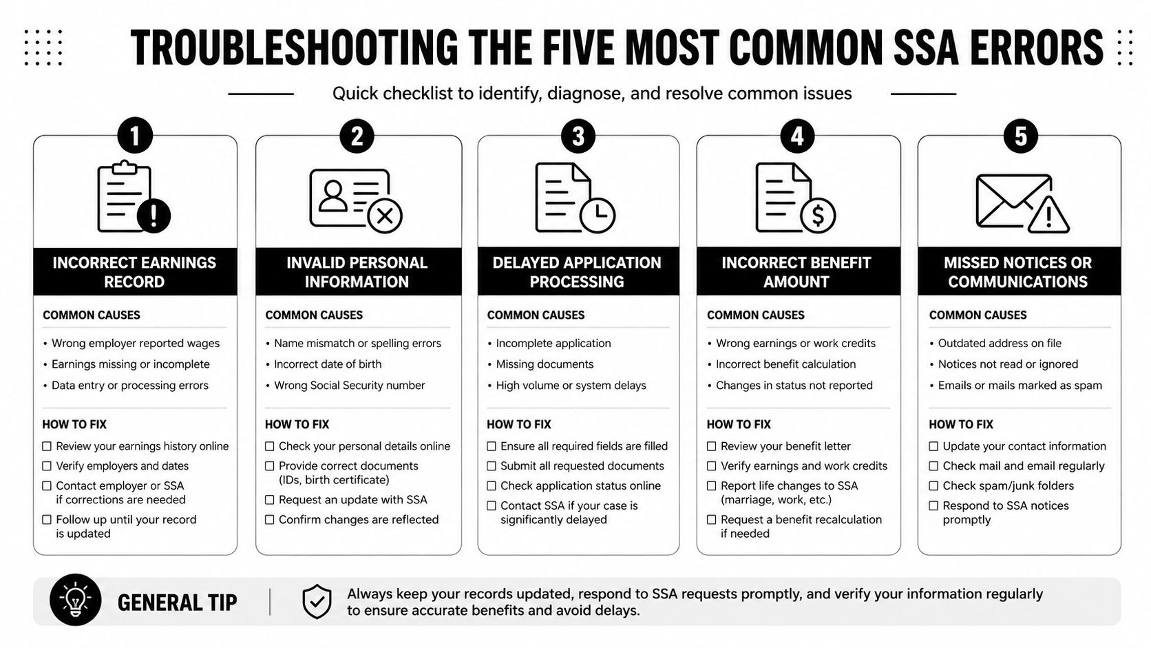
Quick fixes for the usual failures
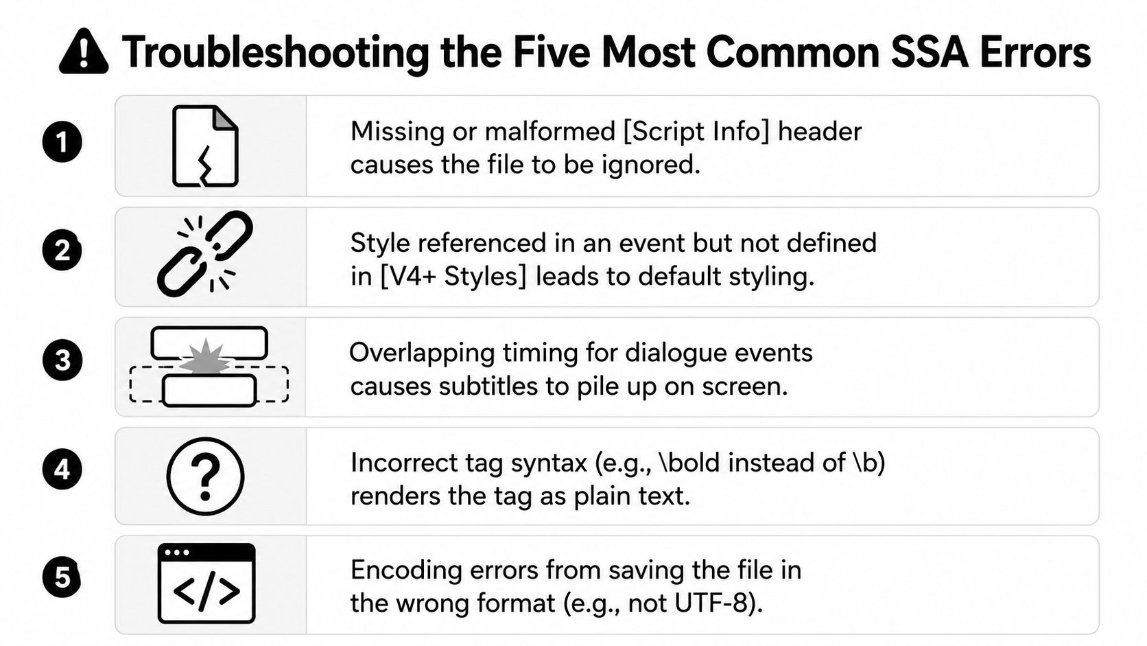
- Missing or malformed [Script Info] headerSymptom: the file doesn't load or gets ignored.Fix: add a valid
[Script Info]section at the top, even if it only contains a basic script type line. - Style name used in Events but not defined in [V4+ Styles]Symptom: captions fall back to a default look.Fix: add the missing style or rename the event to match an existing style exactly.
- Commas used in timestamps instead of periodsSymptom: timing looks wrong or the parser rejects the line.Fix: swap every
0:00:01,500to0:00:01.500. - Unclosed override tagsSymptom: formatting seems to run past the word you meant to style.Fix: close or reset tags inside the curly-brace block before the line ends.
- Encoding saved in the wrong formatSymptom: garbled characters or a file that won't open cleanly.Fix: save as UTF-8 and re-export the subtitle file if your editor defaulted to another encoding.
The fastest habit is to preview each edit immediately after you save it. If one line breaks, the problem is almost always in that line, not in the whole file.
Creating, Validating, and Exporting SSA Subtitles for Short-Form Video
A practical workflow starts with the transcript, not the styling. Write or generate the dialogue first, open it in a subtitle editor, and only then decide which lines need emphasis, top placement, or a separate style. If you prefer a broader production context, Image Studio's post production guide is a useful reminder that subtitle decisions belong inside the edit, not after it.
Start in a tool that fits your comfort level. Aegisub gives power users precise control, Subtitle Edit is simpler for quick fixes, and built-in editors in caption tools can handle AI-generated text before you export it as .ssa or .ass. Save the file, then test-render it in VLC or MPV so you can catch layout problems before you put it on a published video.
A clean export path
- Draft the captions first. Keep the transcript tight and break lines for mobile readability.
- Apply one base style. Reuse it across the clip, then override only the lines that need special treatment.
- Render a test copy. Check alignment, spacing, and whether the caption collides with the frame edge.
- Decide how the platform will receive it. Some workflows keep subtitles as a separate track, while others burn them into the video with FFmpeg and a libass-backed subtitles filter.
- Name files clearly. Use labels like
.en.ssaor.default.ssaso editors know which track is which.
For visual workflows, it helps to compare this with the way subtitles are added in ClipCreator.ai's Premiere Pro guide, especially if you're moving between editor timelines and a standalone subtitle file. The subtitle file is just one piece of the final export, but it's the piece that keeps your captions consistent when you reuse them across multiple short clips.
If you want a faster way to turn short scripts into polished faceless videos with subtitles already aligned to the edit, ClipCreator.ai can handle the heavy lifting. It's built for TikTok, YouTube, and Instagram creators who want short-form content that looks consistent without hand-tuning every caption file. Visit the site, explore the workflow, and see how it fits your next video.

Create your first video in under 2 minutes
Pick a niche, and ClipCreator.ai generates and auto-posts faceless videos to your channels every day.
Join ClipCreator.ai