You publish often, but your audience may still struggle to recognize you. One video uses a polished talking-head format, the next relies on neon captions and trending music, and the third has a quiet, carefully edited look. Each post can work by itself, yet the collection feels disconnected.
That gap is where consistency in branding matters. It isn't a demand for identical videos or a rigid visual rulebook. It's a system that keeps your recognizable cues stable while giving you room to adapt your format, pacing, and creative ideas for TikTok, YouTube, and Instagram.
When Your Brand Feels Like Five Different Brands
On Monday, you post a polished talking-head video with a calm introduction and clean captions. On Wednesday, you publish a fast meme with neon text, loud music, and no familiar sign-off. Friday brings a soft, minimal reel with muted colors and a completely different tone. Each video performs its job, but when someone visits your profile, they may not know whether they're looking at one creator or several unrelated accounts.
The confusion usually comes from small details rather than one dramatic mistake. Your thumbnails may shift from warm colors to harsh contrast. Your opening may take five seconds in one video and begin with a punchline in another. You might call your audience “creators” one day and “content builders” the next. None of these choices is automatically wrong, but together they weaken the pattern people use to remember you.
Recognition happens quickly
Short-form viewers often decide whether to keep watching before they understand your full message. They notice the first visual frame, the rhythm of the edit, the caption treatment, and the emotional feeling of the opening. A recurring color card, familiar intro pacing, or distinctive phrase can act like a small signpost.
Think of a neighborhood coffee shop you recognize before reading its name. You notice the window, the colors, the menu style, and the atmosphere. Your content needs similar cues. The individual video can change, but the overall feeling should remain identifiable.
Practical rule: Keep the signals that help people recognize you, not every detail that appears in every post.
Consistency means recognition over time, not identical repetition. A creator can publish tutorials, reactions, stories, and promotional clips while still sounding and looking like the same brand. The useful question isn't “Does every post look the same?” It's “Would someone who enjoys one post recognize the next one as mine?”
That distinction makes consistency manageable. You don't need to freeze your creativity. You need to decide which parts of your identity stay visible while the format changes around them.
What Brand Consistency Actually Means
Brand consistency is the repeated, recognizable expression of the same underlying identity across the places where people encounter you. Your profile, captions, thumbnails, voiceovers, videos, landing pages, and publishing habits should feel like they came from the same source.
A useful analogy is handwriting. Your handwriting changes when you write quickly, use a different pen, or fill out a larger form, but its basic character remains recognizable. A friend might identify your note from the shape of the letters and the rhythm of the words. Your brand works the same way. The surface can flex while the personality stays clear.
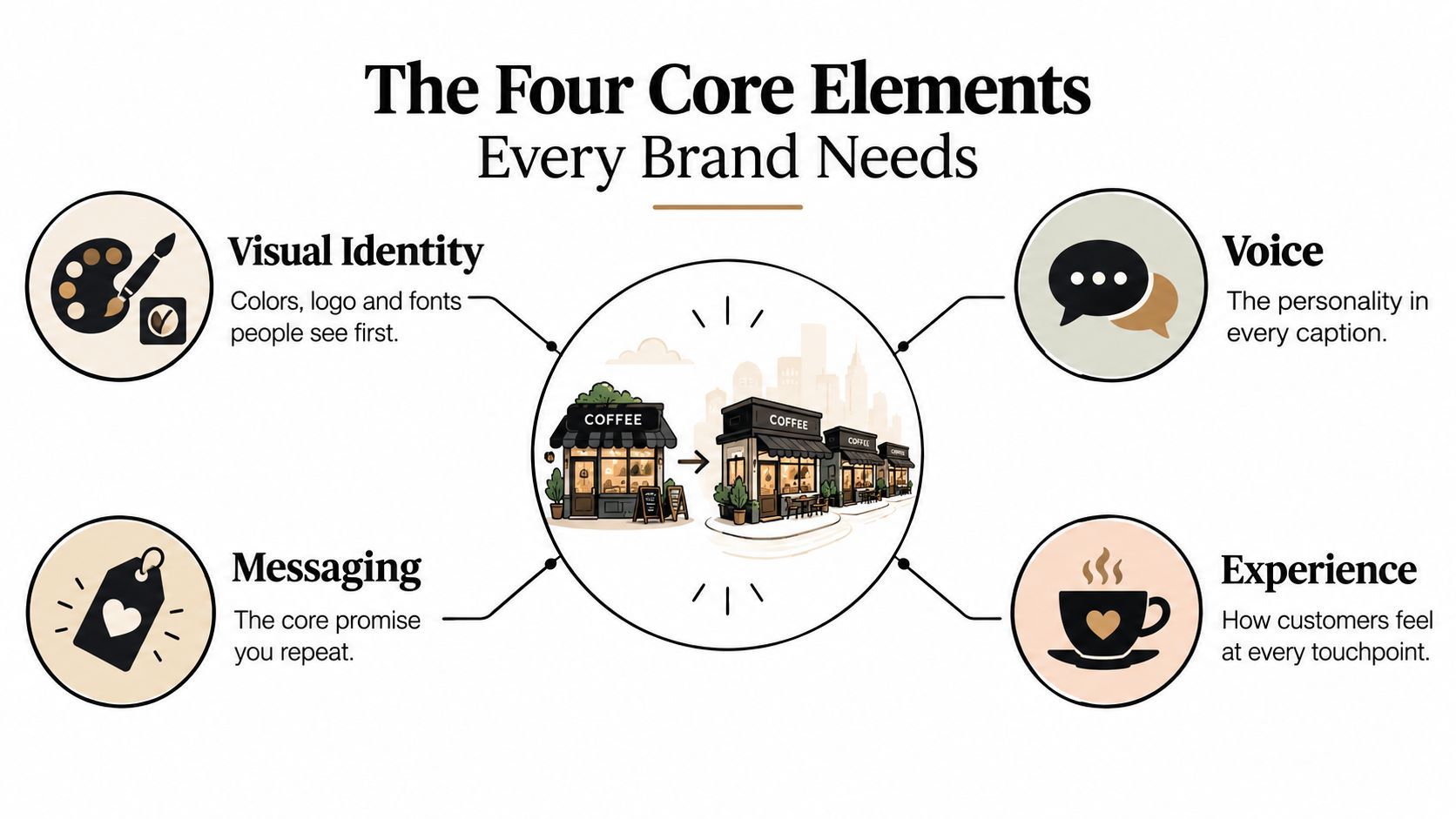
Four connected elements create that identity:
Visual identity
This includes your logo, colors, typography, thumbnail treatment, background style, and recurring graphic markers. A solo creator might use a dark background, one bright accent color, and a consistent subtitle style. A SaaS team might add a logo watermark and a fixed lower-third treatment.
Voice
Voice describes how your brand sounds. Are you direct, playful, reassuring, curious, or analytical? A creator who explains editing tips with calm, plain language shouldn't suddenly use exaggerated, aggressive language because a trend is popular.
Messaging
Messaging is the promise or idea you keep reinforcing. For example, a channel might help busy educators create short lessons quickly, or help small businesses turn long ideas into concise videos. Different posts can address different topics while pointing back to that central promise.
Experience
Experience is how the audience feels across the journey, from the first thumbnail to the final call to action. Predictable structure reduces friction. Viewers know where the hook appears, how the explanation unfolds, and what kind of next step they'll receive.
These layers support one another. A new logo won't fix captions that sound unlike you, and a strong caption won't rescue a visual system that changes without purpose. For a deeper look at how recognizable behavior connects with trust, this brand authenticity and loyalty study offers useful context.
Start by writing one sentence for each element. Choose your visual markers, describe your voice, state your core promise, and define the experience you want people to have. Those four sentences become practical guardrails instead of abstract branding language.
Why Consistency in Branding Drives Real Results
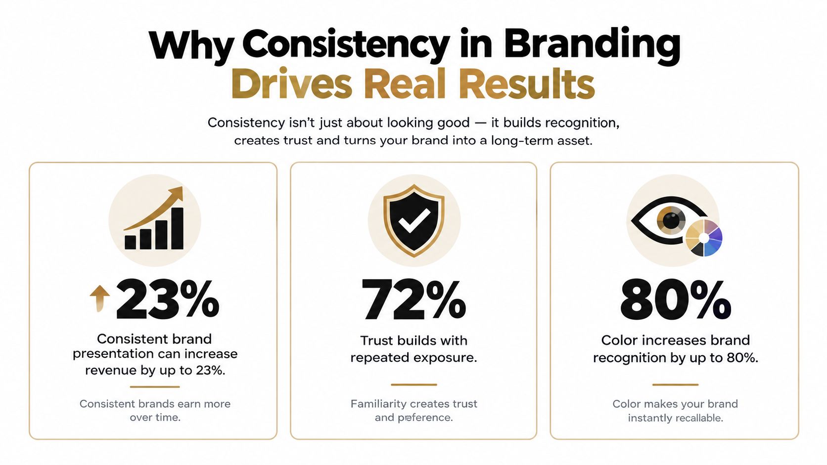
Consistency matters because audiences need repeated exposure to connect separate encounters with the same creator or company. When your colors, tone, message, and structure reinforce one another, people spend less effort figuring out who you are. That clarity can support trust, recall, and more efficient decisions.
The financial case is also meaningful. Research commonly associated with Lucidpress and Marq has been summarized as linking consistent brand presentation with a revenue increase of about 23%, while later industry summaries often describe an uplift ranging from 10% to 33% across touchpoints, as reported by Dasho Content's brand consistency statistics. These figures don't mean every creator will receive the same result. They show why consistent presentation is more than a cosmetic preference.
Creative consistency also has a performance relationship. An analysis of IPA effectiveness data found that the most creatively consistent brands averaged a 3.3 System1 star rating, compared with 2.8 for somewhat consistent brands and 2.6 for the least consistent brands. The same analysis reported that the top 20% most consistent brands delivered 28% more very large business effects, including sales value, profit, and market share gains, according to Omnibound's analysis of brand consistency statistics.
Consistency needs room for life
A perfectly repeated format can become stale. Short-form video depends on changing trends, audience expectations, and platform habits, so copying the same script structure forever can make your content feel automated rather than human.
Recent survey data illustrates why controlled flexibility matters. Only 10% of B2B SaaS teams reported being very consistent across channels, while 60% described themselves as mostly consistent and 29% as somewhat inconsistent in the cited survey from Wynter's B2B SaaS branding research. The same source reports that 70% of respondents connect long-term consistency with authenticity.
The lesson is simple. Lock the cues that build recognition, but let the delivery respond to the platform, topic, and moment. Consistency should make your content familiar, not lifeless.
The Four Core Elements Every Brand Needs
Think of your brand as a local coffee shop that grows into a chain. Every location can have a different layout and serve local preferences, but the menu language, cup design, service attitude, and core promise still identify the same business.
Visual identity gives people the first clue
Visual identity includes the elements people see before they process your words. Choose a compact system that works in vertical video: one primary background treatment, a small color palette, a readable font, and a repeatable logo or watermark position.
For example, place every important lesson inside a color-coded text card. Use one accent color for the hook, a second treatment for examples, and the same subtitle style throughout the video. Your TikTok, Instagram Reel, and YouTube Short can use different crops, but the visual signals remain familiar.
Voice makes the brand sound human
Voice is the personality behind the content. Decide whether your brand speaks like a patient teacher, a sharp analyst, a friendly coach, or a playful storyteller. Then express that choice through sentence length, vocabulary, humor, and the way you address the viewer.
A creator could open educational videos with a steady line such as, “Here's the part most creators skip.” The exact words can change, but the direct, helpful attitude stays intact. If you need more examples for shaping that personality, review these brand voice examples.
Messaging keeps the promise visible
Messaging answers the question, “Why should this audience keep coming back?” Repeat the core promise through different subjects and hooks. A channel about efficient content production might use hooks built around wasted effort, faster workflows, or clearer publishing decisions.
One post can explain templates, another can discuss captions, and a third can show a scheduling process. They remain connected when each one helps the audience create content with less friction.
Experience turns separate posts into a journey
Experience covers what happens from discovery to completion. It includes thumbnail design, opening speed, caption readability, transitions, outro behavior, and the next action you invite.
A simple pattern might use a recognizable thumbnail, a direct hook, three teaching points, and a consistent end screen. Viewers shouldn't need to learn a new navigation system every time they watch you. The structure can adapt, but the journey should feel dependable.
The four elements don't need equal rigidity. Visual cues and core messaging often need stronger protection, while pacing, music, and format can bend more easily. That division creates a system that feels consistent without forcing every platform to behave like the same room.

Fixed Versus Flexible Consistency Across Platforms
Creators often confuse consistency with duplication. A TikTok, YouTube Short, and Instagram Reel may share the same idea, but each platform gives you a different viewing environment. The brand should remain recognizable even when the edit, caption, or opening changes.
| Brand Element | Keep Fixed | Adapt by Platform |
|---|---|---|
| Logo placement | Use an approved position and treatment | Adjust size or crop when the interface covers part of the frame |
| Color palette | Keep the primary and supporting colors recognizable | Change background balance for readability |
| Brand voice | Preserve the same personality and vocabulary | Match the audience's expected level of speed and context |
| Core tagline | Keep the central promise intact | Shorten it for captions, hooks, or end screens |
| Video length | Protect the amount of explanation needed | Edit the same idea into a shorter or longer version |
| Caption length | Keep the tone and message aligned | Use platform-appropriate caption depth |
| Hook pacing | Begin with a recognizable point of view | Tighten the opening when the format demands speed |
| Music choice | Keep the emotional fit with the brand | Use platform-relevant audio when it doesn't conflict with the tone |
| Thumbnail cropping | Preserve key text and visual hierarchy | Reframe for each platform's display area |
Consider a creator who uses the same color card and outro on TikTok and YouTube Shorts. The TikTok version might begin with a fast question and use energetic music, while the YouTube version may include a little more context. The color card, subtitle treatment, and closing promise still tell viewers they're watching the same creator.
A second creator might turn a 60-second explanation into a 15-second Instagram Reel. The shorter version removes background information, but it keeps the same hook language, accent color, and final action. The content changes shape without losing its identity.
A flexible brand changes its clothing for the platform, not its personality.
Before publishing, separate each decision into two questions. First, ask whether the element helps people recognize you. If it does, protect it. Second, ask whether the element exists mainly to fit the platform. If it does, test variations without treating them as brand failures.
A Workflow That Keeps You Consistent at Scale
A consistent publishing system starts before the script. It begins with a small set of decisions that make the right creative choice easier when you're tired, rushed, or producing several videos at once.
1. Write one page of rules
Keep the document short enough to use. Define your voice, color palette, fonts, logo treatment, subtitle style, and must-keep markers. Include examples of approved phrases and phrases that don't fit. A watermark, lower-third, signature sound, or recurring opening can provide a strong recognition signal.
This page should answer practical questions. Can captions use slang? Should the brand make jokes about sensitive topics? Does the logo appear in the opening, closing, or both? Clear answers reduce subjective decisions during production.
2. Build templates for repeated work
Create reusable layouts for intros, outros, captions, thumbnails, and common video formats. Store the approved versions in a shared drive with clear names, so a teammate doesn't accidentally use an outdated file.
Templates should protect the elements that matter most while leaving editable space for the topic. A fixed subtitle style can coexist with changing footage, hooks, and background imagery.
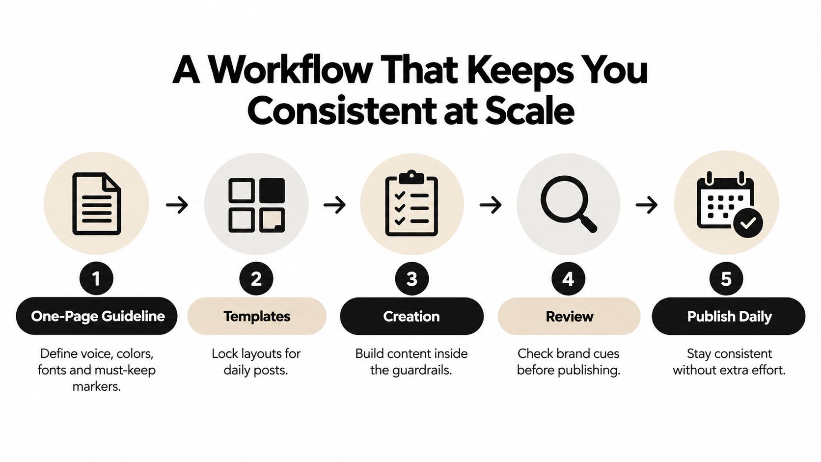
3. Create inside the guardrails
Use prompt libraries for scripts and captions. Each prompt should specify the audience, tone, structure, approved vocabulary, prohibited claims, and desired call to action. This is especially useful when AI-assisted tools produce drafts, because a general instruction such as “make it engaging” won't reliably preserve your identity.
Organize prompts around your content pillar strategy, then give each pillar its own hook patterns and examples. Your brand voice stays stable while the subject matter changes.
4. Review recognition signals
Before publishing, check the first frame, opening line, subtitle style, color treatment, and closing action. A solo creator can use the same checklist privately. A team can have one person review the final export rather than every early draft.
Fluidwave's guide to systems for consistency provides additional practical context for turning recurring work into repeatable processes.
5. Schedule and automate carefully
Queue content by platform, but don't assume one export fits every channel. Use saved editing presets, automatic caption styling, batch production, and format-specific export settings. These choices reduce manual variation without removing human review.
ClipCreator.ai is one option for teams producing faceless short-form videos. It can generate scripts from prompts, pair narratives with visuals and voiceovers, apply subtitles, and support scheduling for TikTok, YouTube, and Instagram. The useful branding principle is the same regardless of tool: automate the repeatable cues, then review the parts that require judgment.
Measuring Consistency Without a Spreadsheet Overload
You don't need a large dashboard to find brand drift. You need tests that reveal whether people can recognize your content when the obvious labels disappear.
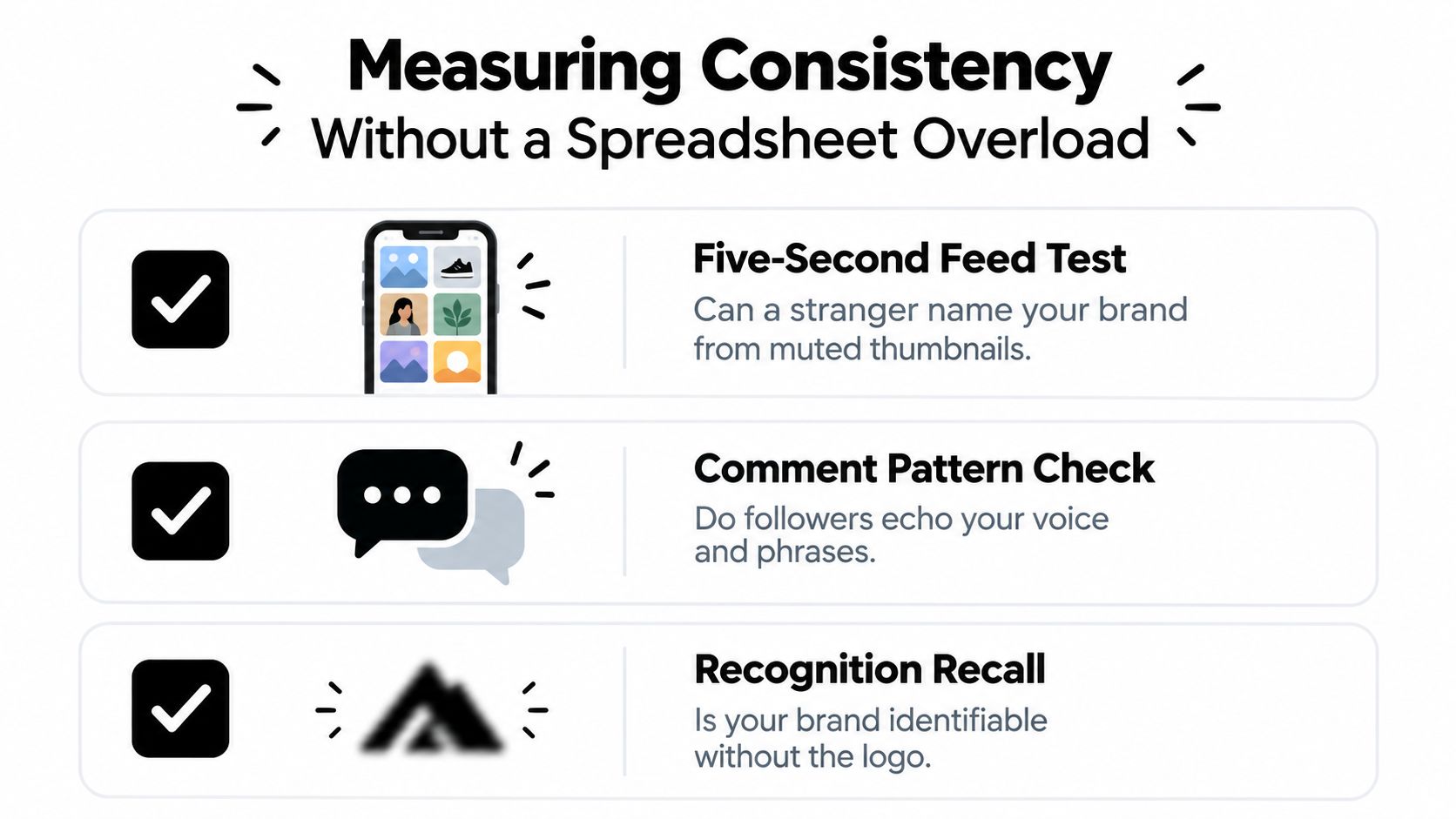
Use the five-second feed test
Collect a small stack of recent thumbnails from TikTok, YouTube, and Instagram. Hide usernames and logos, mute the screen, and show the images to someone who isn't closely involved with the brand. Ask what seems to belong together and what feels unrelated.
Pay attention to the visual details they mention without prompting. If they notice the same color treatment, layout, or subtitle style, those cues are carrying recognition. If they can't group the posts, identify which visual choices are competing.
Listen to the audience's language
Review comments and note repeated words, phrases, and descriptions. Do followers echo your recurring expressions? Do they describe your content using the promise you intended? Those patterns can show whether your voice and messaging are becoming associated with you.
You can also compare one post from each platform during a monthly review. Look for drift in four areas:
- Visual identity: Are the colors, fonts, and markers still recognizable?
- Voice: Does the language sound like the same person or team?
- Messaging: Does the post support the core promise?
- Experience: Does the journey from thumbnail to outro feel familiar?
Use a simple score from one to five for each area, but treat the result as a conversation starter rather than a scientific measurement. Engagement stability can provide a soft signal, yet algorithm changes and platform differences make it unsafe to treat engagement alone as proof of brand consistency. For a broader performance review, use this guide to track content performance.
The best audit is one you'll repeat. A short monthly check and a deeper quarterly comparison can reveal patterns long before inconsistency becomes obvious to everyone else.
Your Consistency Checklist and Final Takeaways
Use this checklist before your next upload:
- Four elements: Confirm that visual identity, voice, messaging, and experience still point to the same brand.
- One-page guideline: Keep approved colors, fonts, phrases, markers, and review rules in one accessible place.
- Fast templates: Prepare reusable formats for your most common hooks, captions, thumbnails, intros, and outros.
- Recognition test: Review muted thumbnails monthly and ask whether someone could identify the brand without the logo.
- Review rhythm: Make quick checks part of publishing and conduct a fuller comparison across platforms each quarter.
- Controlled flexibility: Lock recognizable cues, then adapt length, pacing, music, cropping, and captions to the platform.
Branding isn't installed once and left alone. You maintain it through repeated choices, useful templates, and occasional adjustments when the audience or channel changes. Before your next upload, open your latest three videos side by side and mark the one cue that connects them most clearly. Protect that cue in your next batch.
ClipCreator.ai helps creators and teams produce short, faceless videos with AI-assisted scripts, visuals, voiceovers, subtitles, and multi-platform scheduling. Visit ClipCreator.ai to build a repeatable video workflow that keeps your recognizable brand cues intact while you publish faster.

Create your first video in under 2 minutes
Pick a niche, and ClipCreator.ai generates and auto-posts faceless videos to your channels every day.
Join ClipCreator.ai